Posts

Showing posts from April, 2014

A Statement Chair and One Kings Lane
Image
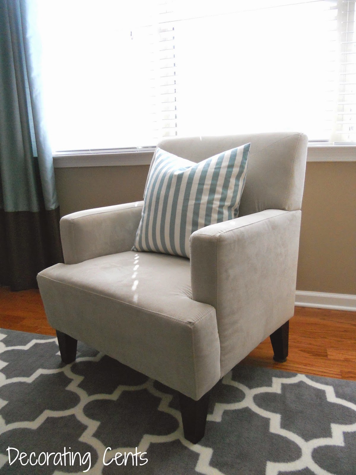
I was recently contacted by One Kings Lane to share a statement chair in my home to help introduce their Home Decor Resource Guide .  It's a tool homeowners can use to help determine the style and origin of their favorite chair.  It was created to inspire and educate home decor enthusiasts like myself when purchasing and reupholstering the perfect statement chair.  This was hard for me because we don't have a wow statement chair in our home but I know which one is our favorite.     Everyone runs to this chair when we're all watching TV.  It's soft and comfortable and when you pull the round ottoman up under your feet, you can relax there for hours.  Just ask my husband.  It's a neutral chair upholstered with microfiber.  With two kids we needed something that could take a spill and be cleaned up easily.  I think our chair would fall into the Modern American category because of the clean lines. When choosing a chair for the family room, we knew it had

Gray Front Door

Image
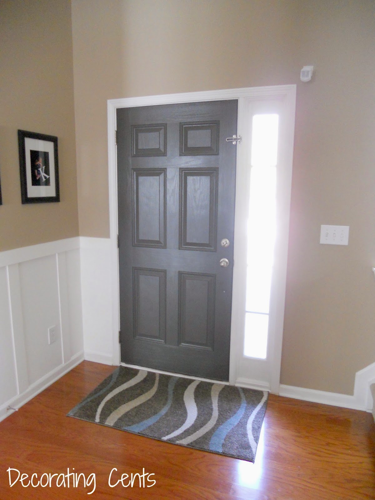
Well I finally did it.  Paint the front door that is.  I've been seeing the interiors of front doors being painted around the web forever and wanted to give it a try.  It's just paint right?  If it didn't work out, I could paint it back white.  But turns out I love it!     I was going back and forth between a gray door and a blue door.  The main accent color throughout our home is blue so I was going to go blue.  The husband had the final say.  He didn't want a blue door so I went gray.  We loved the dark gray in the loft so much, we used it on the front door interior too.  The color is Behr Intellectual. I painted the door Saturday afternoon.  After it was painted, it was hard not to walk by and think that the door wasn't open.  It takes a second glance to make sure it is indeed closed.  The dark gray door gives the entry a deep, moodier look.  I thought the space would feel darker but it doesn't, just a deeper contrast between the beige and white.  I

Dot & Bo

Image
Recently I've discovered a new website called Dot & Bo .  It's a website with modern design ideas and they share affordable pieces to help you achieve the style you want.  The styles they offer are fabulous.  They make it easy to decorate your home with quality pieces.  I love getting my daily email with designs that really inspire me. Their daily email inspirations are curated collections but you can find all kinds of home decor pieces on their website.  Here are some sales going on now. Shades of Gray chair / pillow / frame / rug / mirror Contemporary Art & Design side table / clock / chair / bookend / rug Organic Modern Dining dining chair / pendant / teak bowls / dining table / mugs Head over to Dot & Bo and take a look at some of their stylish pieces.  Be careful though, you may spend more time there than you thought.  It's hard to pull away from all the pretty eye candy.

Model Home Inspiration

Image
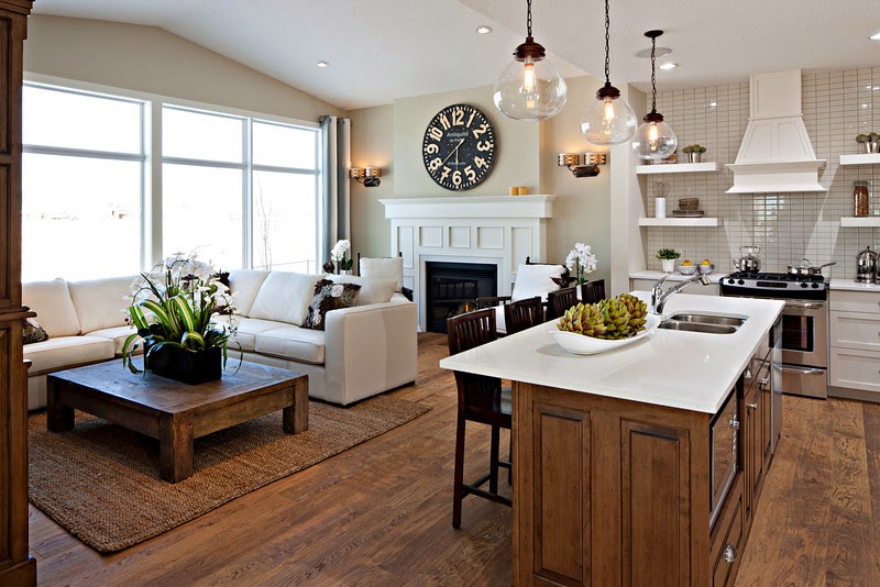
I wanted to share a recent home finding with you.  Most of the rooms of this house I could live with. The family room has natural tones.  Although I would love to see some color here, the room is still pretty.  I really like the clock over the fireplace. It's open to this beautiful white kitchen.  They brought the wood tones over in the island and bar stools and it breaks up the white nicely.  The hardwoods floors are wide planked and rustic looking.  The pendants are beautiful.  The color of the chain brings in more brown and takes your eyes up.  Looks like speakers are in the ceiling for a sound system.  It would be nice to have music playing in the background while cooking dinner.  Notice the open shelves on the left.  Open shelving is trending now and really does open up a space.  My only concern is my shelves would never look neat. Next to the kitchen is the breakfast room.  Nice little nook and the large window allows for a view out.  The chandelier is the perf

DIY Paint Stick Wall Art

Image
Every time I go into Home Depot, I grab a few paint sticks.  I figure I can never have enough.  My stash was pretty good so I decided it was time to do something with them.  I wanted to make some kind of wall art.  I saw this one a while back and was inspired to create my own using different materials. I started out with a piece of foam board I had in the closet.  It was the perfect size for the wall I was using.  I had some regular paint sticks and four of the larger ones. I placed them around the outside of my board to figure out the cuts I needed to make. I cut the rounded sides off using my miter box.   After my frame was cut using the larger paint sticks, I began cutting the smaller ones.  I cut random lengths to fit into the frame.  I wanted a staggered look so there really was no measuring.   After all my cuts were made, I painted the pieces.  I used blue and green craft paint for my color scheme to match the decor already in the house.  Some of

Stylish Toy Storage

Image
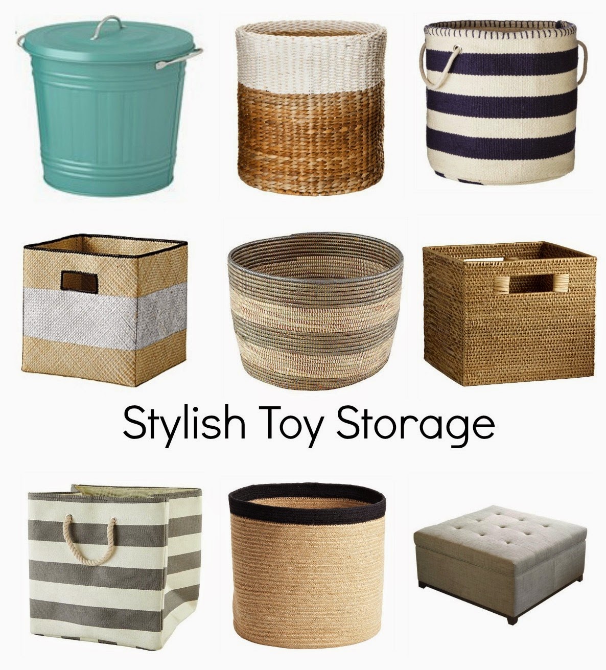
Sometimes it feels as though the kids' toys are taking over the house.  When my daughter was born, I told myself we would never had toys downstairs.  They would stay upstairs in their rooms.  Yeah well, fast forward to today with two kids.  Toys are downstairs and taking over.  It should have been obvious from the start their toys would end up in our living spaces.  I try to keep them corralled in one spot of the family room once the kids are done playing with them, but the bright green dinosaur doesn't exactly go with our decor.  I've come to the point where I need to store them in stylish ways.  I don't mind having the toys downstairs now, I just want to put away.  Some of the smaller toys are now in the leather ottoman that I hope to replace one day with a real coffee table. Here are some toy storage solutions for keeping those toys put away but still having the family room, or any part of the house, look presentable.   1 / 2 / 3 / 4 / 5 / 6 / 7 / 8

HGTV Smart Home 2014

Image
I'm a big of HGTV.  Who isn't?  Every year they come out with homes that are designed to the max and this year they are featuring a Smart Home .  It boasts the latest in technology with eco-friendly features and is energy efficient.  This new home was built in Nashville, TN. Exterior - Beautiful! Foyer - The hallway opens up to the dining room, great room, and master bedroom. I love the blue door. Dining Room - A big pop of red when you walk in the house.  The color red is supposed to increase the appetite.  Remember that next time you go to dinner at your favorite restaurant. The sliding barn doors are a neat touch.  I like that you can shut the doors for privacy if you need to.   Butler's Pantry - I don't have a butler but this little nook is really nice.  It sits between the kitchen and the dining room.  It also has a built in stainless steel wine cooler.  I really like the light gray cabinets. Kitc