Posts

Showing posts from April, 2015

Gray Accent Wall

Image
If you've been reading this blog for a while, then you know I love a good accent wall.  It can add some contrast to an otherwise flat room.  Our master bedroom has a very light wall color.  I love how much sunlight it gets during the day but it can make the room feel washed out sometimes.  I wanted to give it some depth.  I thought a darker wall color behind the bed would do exactly that.   I love the contrast of the darker wall now.  I wanted to change the metal wall art that was above the bed.  It was dark and thought something lighter would be better.  I spotted this mirror at Target.  It fits perfectly in this spot.  The mirror is an antique gold color so it contrasts against the gray.  I like how it reflects the chandelier too.   I can see the end ahead.  A few more details to add before I think I can call it done. Check out the progress in the master bedroom: Master Bedroom Plan DIY Fabric Trimmed Curtain s New Plan Progres s New Des k DIY

Another Placemat Pillow

Image
It's Friday.  It's Friday.  The end of the week and the last day.  At least for the work week anyway. You may remember I bought three placemats from Target.  Two of them I stuffed here and they easily became pillows for the master.  The third pillow wasn't double sided.  It was only one layer so I couldn't just stuff it. Since it was only one layer, I needed another fabric to become the back.  I had some extra fabric leftover from an Ikea curtain that I could use.  It was about 54 inches wide and each side was finished.  This was perfect for an envelope closure.  I didn't have any extra zippers laying around so that wasn't an option.  I wanted to use what I had. The placemat was 14 x 19 and wasn't quite big enough for my 12 x 20 pillow insert.  Using a seam ripper, I opened up all the seams to give me the biggest surface area possible. Since my pillow insert was 12 x 20, I cut my fabric 13 x 20.  I was going to go 21

Pink Headboards

Image
Pink headboards always draw me in when browsing online.  They really add a striking pop of color to a bedroom.  I was never one for light pinks but I tend to gravitate towards hot pink while shopping in stores.  These headboards may make you think twice about the color.  Whenever I makeover my daughter's bedroom, I think a pink headboard would be a winner. I really love this tufted version. This pink talks in this black and white bedroom. Pink really looks great in this shared bedroom .  Even the ceiling is pink! This painted version really steals the show. This painted metal one glams up a big girl room. Hello pretty curved nailhead headboard .  The best part?  It's a DIY! This is one gorgeous pink and white patterned headboard.  I wouldn't mind having one for myself. What do you think about pink?  Too girly or just the right amount of color?   You're reading Pink Headboards by Andrea, originally

DIY Placemat Pillow

Image
I've been racking my brain trying to figure out what pillow formation I want to use on our bed in the master.  I've been searching online for fabrics and even Etsy for pillow covers.  I showed you a while ago the pillow cover I liked at West Elm but it sold out before I could get my hand on it. Well last week I was walking though Target.  On a last minute whim, I walked through the kitchen linens.  They had a great assortment of cloth napkins and tablecloths.  I came across a few I liked and grabbed them up. I loved the patterns on these and the two fabrics coordinate perfectly.  I knew throw pillows were in order. To make them I grabbed my seam ripper and a few old toss pillows I had stuffed in a closet and wasn't using anymore.  I started by using the seam ripper to open a side seam.  I made the hole just big enough to get my hand in. I opened an old pillow and removed the stuffing.  I fluffed it up some and stuck it into my new pillow.  After

Get The Look: Z Gallerie Sapphire Saturation

Image
I mentioned to you last week about getting the new Z Gallerie catalog.  One of the last photos is of this gorgeous blue, white, and chrome dining room.  Swoon.  They call it Sapphire Saturation. I absolutely love the color scheme here.  The dark navy blue against the clean look of the white really pops.  Z Gallerie is a little rich for my wallet but that doesn't stop me from getting ideas from their catalog. I pulled a few pieces from around the web to re-create this look on a more affordable budget. white leather chair / geometric rug / waves art / curtain rod / blue medallion pillow / blue ikat pillow / silver accent table / candlesticks / teardrop vases / cutout chair / watercolor print / chandelier / swoop chair   Do you love this color combo too?   You're reading Get The Look: Z Gallerie Sapphire Saturation   by Andrea, originally posted on Decorating Cents .  If you've enjoyed this post, be sure to follow Andrea on Facebook ,

White Pintuck Bedding

Image
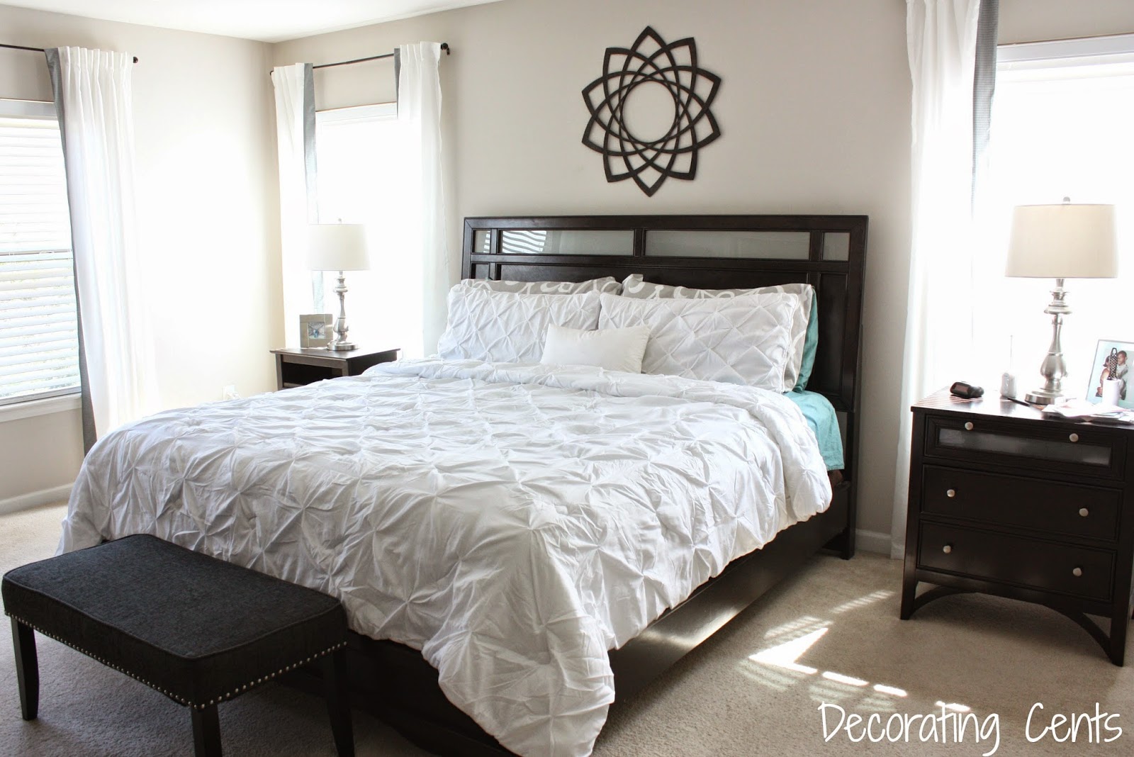
Happy Monday!  It always seems like the weekend flies by.  I didn't do much.  It was a lazy weekend for me so not much happened around the house.  I did get some cleaning in though.  Boring, I know. On Friday I picked up some new bedding for the master bedroom makeover.  I showed you some options I had last week.  I had decided on the ruched bedding from Walmart.  I went in for it on Friday and walked out with something different.  Next to the ruched bedding was pintuck bedding .  I had always liked this texture so I went for it.  It jumped in my cart.  I couldn't wait to get it onto our bed.  This set got great reviews and was cheaper than some of the more expensive designer brands. The white instantly made our room look lighter.  It already gets a lot of sun in here so it was bright.  This is a comforter set, which I wasn't going for, but it was nice to just throw the comforter on instead of fighting with a duvet and cover.  I loved that the comforter actually ha

Hello Mirror Of My Dreams

Image
I got the newest catalog from Z Gallerie this weekend.  Let's just say I about drooled the whole way through.   One thing that really caught my eye was this Fiamma mirror . Isn't it gorgeous?  It's huge coming in at 50 inches wide.  I wanted it until I saw the price tag of $499.  I don't know about you, but that's a little out of my price range.  I decided to take a look around and see if any of their other mirrors were better suited for my wallet. I've seen this one around the web quite a few times.  It's the popular Devon priced at $229.  I love the smaller beveled mirrors around the outside. I also love this Avila mirror.  It would look like the sun shining on your wall.  Price tag on this one is $299.  Still a little much for me. I really like all these mirrors but I know I can find one similar at a much better price.  I'm looking to replace the metal piece above our bed in the master.  I see cool mirrors all the ti

White Bedding Options

Image
Hey ya'll.  Yeah, I'm still here.  I was taking a little bloggy break.  Life got in the way.  There hasn't been much going on around the house so I didn't want to force anything here on the blog.  It felt good to step away for a bit. So back to the master bedroom.  It's still unfinished.  I think my initial jump on a project is fun but then I get bogged down with so many ideas that I push it aside.  My next thing to look for is bedding.  Remember here I told you about how I was liking white bedding.  We were out of town with the kids last week for spring break.  The master bedroom had white bedding.  Even though it was white and simple, it felt so luxurious and clean and crisp.  That stay confirmed it was white bedding I wanted.  I've started searching to see what my options are without breaking the bank. Look at this ruched comforter set from Walmart.  Yep, I said Walmart.  It looks more expensive to be so affordable.  I love the ruching.  Even if th