Master Bedroom Reveal
Yes, I know it has taken me 6 long months to complete this space. Most of it has been done but it's the final little touches that stopped me. I know most rooms are never done so this will not be the last time you see this room. I'm excited I finally got a chance to take photos and show you. Brace yourself, there are a lot.
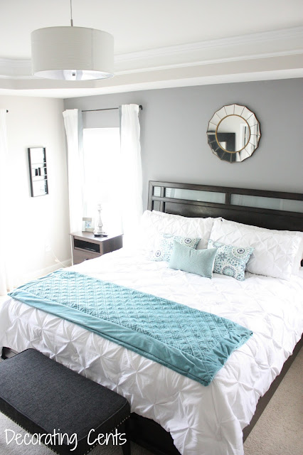
The biggest changes in the room are probably changing the bedding to white, painting a gray accent wall behind the bed, and changing the wall art to a fabulous mirror.

This is hubby's side. I was able to find a nightstand that went with the rest of our furniture. I really wanted to find a matching nightstand to mine but it's hard finding just one nightstand. I searched Craigslist and found one but no one ever responded.
On his nightstand is a recent photo of us.
In the corner between the nightstand and large window are some pictures from our wedding day. Since this room is our retreat, I tried to keep most of the photos of us. It's amazing to see how far we've grown together.
Of course, I had to get a floor mirror. This one is from Ikea.
Now on to my side of the bed. This is the original nightstand that came with out set. I love the dark espresso and that it sits higher than most nightstands I've seen.
Here's a side view of this area.
We mounted to television to the wall over the dresser.
The top is pretty simple here. Believe me, it normally does not look this clean.
I picked up this gray nailhead bench from Target. It definitely helps with getting ready in the morning. The kids love it too, especially my son. He can get on the bed with no problem now.
On the other side of the room is the sitting area. I decided to turn it into an office. It gave me space to blog without running to our other office in a separate room.
I love the desk I chose. It's a simple one from Ikea. The glossy white top makes it feel more classy.
A nice chair that didn't look like an office chair was a must have.
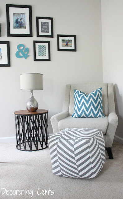
I put together a gallery wall with random objects and again, photos of us.
In the corner is a chair that I'm so glad we got. Originally we were going to get two chaise lounge chairs but in the end it may have been too cramped and we normally don't come into this space at the same time.
For knick knacks and office supplies, I bought this shelf from Ikea. It was inexpensive and fit the bill.
I love this picture of hubby with the kids in Charleston.
So there you have it! All done. I'll be back with a source list, hopefully later this week. It was hard enough getting all these photos done.
For the full room source list, go here.
Check out the progress in the master bedroom:
Master Bedroom Plan
DIY Fabric Trimmed Curtains
New Plan
Progress
New Desk
DIY Acrylic Tray
Bedding Options
White Pintuck Bedding
DIY Placemat Pillow
Another Placemat Pillow
Gray Accent Wall
The Chair
You're reading Master Bedroom Reveal by Andrea, originally posted on Decorating Cents. If you've enjoyed this post, be sure to follow Andrea on Facebook, Pinterest, Bloglovin, and Hometalk.
Sharing with
DIY Showoff * Between Naps on the Porch * Creatively Living * Keeping It Simple * Sew Can Do * Skip to My Lou * The Dedicated House * A Bowl Full of Lemons * A Stroll Thru Life * Elizabeth & Co * Flamingo Toes * Homework * Home Stories A to Z * Ladybug Blessings * New Nostalgia * The Winthrop Chronicles * DIY by Design * Ginger Snap Crafts * Handy Man Crafty Woman * Savvy Southern Style * Simply Designing * The Blissful Bee * Anderson + Grant * Bloom Designs * Embracing Change * No Minimalist Here *


Very beautiful and inspiring! Visiting from Monday Funday linky party!
ReplyDeleteRelaxing and so nice! Love how you floated the desk too!
ReplyDeleteThis truly is a master bedroom retreat! Can't wait to explore your site for more ideas. I'm very new to this world of home decorating blogs. What a fun journey this is going to be. (I found you on The Dedicated House - Make it Pretty Monday.)
ReplyDeleteWow Andrea, I love the light & airy presence your color palette brings. Breaking the room up into functional sections shows how you made great use of the space as a whole. Beautiful!
ReplyDeleteSo beautiful!! We are currently working on our master now. Yours looks so fresh and serene! Perfect! Visiting from homestoriesatoz tips & tutorials link party. :)
ReplyDeleteI love the color and layout, perfectly done!
ReplyDeleteBeautiful layout and I love all your colors!
ReplyDeleteThe gray and white are so lovely. The punch of aqua really sets this room apart. Pinned!
ReplyDeleteThis is a beautiful room. Very serene and relaxing, just like a bedroom should be. But at the same time I love the pops of the aqua color. And the study area is a welcome surprise. You must have a really big room... My bedroom barely holds the bed..lol.
ReplyDeleteIt turned out so pretty! I love the turquoise accents :)
ReplyDeleteSuch a lovely room! Thank you for sharing. You are one of the features at the Make it Pretty Monday party at The Dedicated House. Here is the link to this week's party. http://www.thededicatedhouse.com/2015/07/make-it-pretty-monday-week-144.html Hope to see you again at the bash! Toodles, Kathryn @TheDedicatedHouse
ReplyDeleteLove your collage wall--the simple black frames and the soft blue. so serene! Glad I saw you on the MondayFunday link party! Cheers! Shana from Technotini.com
ReplyDeleteAndrea, the Weekly Feature Series is live. Head on over to check out your feature and the other 24 features from the week. Here is the link so you can check it out. http://www.thededicatedhouse.com/2015/07/weekly-features-series.html Have a lovely Sunday! Toodles, Kathryn @TheDedicatedHouse
ReplyDelete