Posts

Showing posts from March, 2015

The Kitchen: Three Years Later

Image
The biggest and best DIY project to date has been our kitchen cabinets makeover .  I get lots of questions about the process of painting them, what we actually used to paint them, and how they've held up. We painted our kitchen cabinets three years ago using a Rustoleum Cabinet Transformations kit.  It's hard to believe it was so long ago.  The color used was chocolate but we used the optional glaze on top to make them darker.  You can see the step by step process here . The cabinets have held up great!  We use our kitchen daily and we are a family of four so there's constant banging and opening and closing of doors.  I did start to wonder if the paint would start to show wear because naturally paint on certain surfaces can start to peel and chip away.  Not these cabinets.  I give them a good wipe down a few times a month to get rid of any dust, grease, or any other food particles that can buildup in the kitchen. My biggest concern was the island.  We all

Clark + Kensington and OPI

Image
Guess what ladies!  You can now get your favorite nail color on your walls.  I was browsing the Ace Hardware website and stumbled on this info.  OPI has partnered with Clark + Kensington and it's exclusively at Ace Hardware. I have a few favorites and wanted to share. These I would definitely wear these colors on my hands.  I like reds and pinks on my nails so I'm not changing nail color every few days to match my outfit. For the walls I would be more neutral.  This makes it easy to change up the look of your room with colorful accessories. I love these two colors.  They would be great for accent walls or if you're bold enough, paint an entire room. Go check out all the colors available here .  I haven't read any reviews on it so I'm wondering how true the colors are on the wall in comparison to the nail colors.   You're reading Clark + Kensington and OPI by Andrea, originally posted on Decor

Friday Five

Image
It's Friday!  It seemed like it didn't get here soon enough.  Not like I'm trying to rush through life, but I love the weekends.  Lots of family time and getting things done around the house.  And you know what else?  It's the first day of spring!!!  Woo hoo.  It's been feeling like spring around here for the last week or so.  The change in temps has been nice.  I don't care for cold weather so spring is welcomed with warm arms. I wanted to share some things with you that have caught my eye over the past week. 1) I made a quick stop into Target this week and noticed the new Threshold items out for spring.  The bright colors are gorgeous!  There was lots of pink and gold on display.  I love the pink ottoman.  Makes me want to re-do my daughter's room just to get one. ottoman / lamp / pink pillow / navy pillow / tray Items are an extra 10% online with the code SHAMROCK.   2) Speaking of Target, they are having a sale on shoes for the famil

Chic Work Spaces

Image
Since getting my new desk, I've been trying to find ways to organize it while keeping it pretty.  It is within our bedroom so it must remain well organized and pleasing to the eye. I've found some organized work spaces from around the web.  They are not only functional but gorgeous as well.  If your work space looks great, you're bound to be more productive right?   source   source   source   source   source   source   source   source   source   source   source Are you feeling inspired to create a beautiful work space for yourself now?   You're reading Chic Work Spaces by Andrea, originally posted on Decorating Cents .  If you've enjoyed this post, be sure to follow Andrea on Facebook , Pinterest , Bloglovin , and Hometalk .

DIY Magazine Files

Image
On a recent trip to Ikea, I picked up a pack of the Flyt magazine files.  I wanted to add some storage to the master bedroom for our magazines and books.  They usually just end up in the floor next to the bed or in a corner when I'm tired of stepping over them.  I had purchased a shelf, also from Ikea, to house these books and other decorative items. I want that workspace to look organized and not get cluttered since it is in our master bedroom, the place of rest and retreat right?  I figured adding scrapbook paper to the fronts of them will make them coordinate with the rest of the space without spending a ton of money. These are the magazine files right out the pack .     They aren't real attractive on their own.  Just plain, white cardboard.   The white just wasn't going to work for me.  It was too stark.  To cover them, I simply traced the spines of them onto my scrapbook paper.   They look much better wrapped.  Well, not really wrapped.  I just

Mid-Century Modern Dining Room

Image
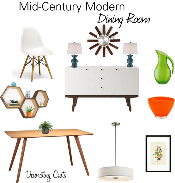
Mid-Century Modern is becoming one of my favorite design styles.  I decided to put together a style board of this style. dining table / clock / chair / buffet / pendant / honeycomb shelf / table lamp / art print / orange bowl / green pitcher   You're reading Mid-Century Modern Dining Room by Andrea, originally posted on Decorating Cents .  If you've enjoyed this post, be sure to follow Andrea on Facebook , Pinterest , Bloglovin , and Hometalk .

DIY Acrylic Tray

Image
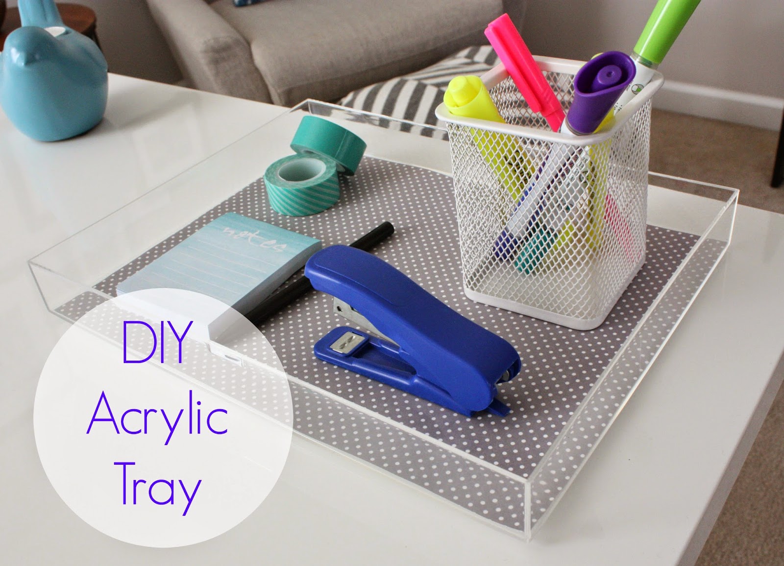
I wanted to add some storage to the top of my desk.  Since I love the sleek and shiny desktop, I didn't want anything too heavy or dark covering that up. I searched online to see what some options were without spending a ton of money.  I came across several for an acrylic tray.  I grabbed one of these acrylic frames from Michaels.  I removed the cardboard insert. I cut a piece of scrapbook paper to size to fit the inside of the frame. Voila!  A cheap and easy tray for my desk.   It's lightweight and clear so it doesn't look like it's taking up a huge portion of my desk. It's just the right size to hold the basics.  I don't want this space to get cluttered. What are some of your desktop storage ideas?  Check out other projects in the master bedroom: Master Bedroom Plan DIY Fabric Trimmed Curtain s New Plan Progres s New Desk   You're reading DIY Acrylic Tray by Andrea, originally posted on Decorating C